Focus Stack
How to Create a Simple Dropdown Component in React
August 20, 2019
In this tutorial we’ll build a simple dropdown component in React using CodePen. This is the first installment of a multi-part series. By the time we are finished, our dropdown component will be not only extremely flexible and customizable for advanced use cases, but also super easy to use for simple use cases.
This quality of being easy-to-use for simple use cases but also easily extendable and configurable for advanced use cases is one of the most obvious indicators of great API design. It is often taken for granted because most of us only notice when APIs could use some love, rather than when they are well-designed.
This tutorial assumes familiarity with web development in React and will not pause to explain fundamentals. If you are new to React, I highly recommend working through the React documentation’s own Tutorial: Intro to React.
Target feature list
Here’s what our completed dropdown component should support out-of-the-box:
- Customizable layout, styling, and click behavior for each menu item, with reasonable defaults
- Infinitely nestable submenus
- Configurable animations, with reasonable defaults
- Compliance with accessibility standards
In the interest of getting the component to an initial working state that we can iterate on, we will start simple. Here’s what our dropdown will be able to do by the end of this post:
Let’s begin by creating a new pen. Navigate your browser to CodePen and click Create -> Pen.
Note: You may want to sign into or sign up for a CodePen account in order to make sure that the state of your pen is persisted so that you can return to it easily in the future.
Next, let’s get a React component rendering on the page! In the HTML editor, create a node for our React component tree to render into:
<div id="root"></div>Needless to say, we’ll be doing most of our work in the JavaScript editor. The following code defines a Menu component that renders its children into a div. We’ll render a Menu instance into the root node:
const Menu = ({ children }) => {
return (
<div>{children}</div>
);
};
ReactDOM.render(
<Menu>hi</Menu>,
document.querySelector('#root')
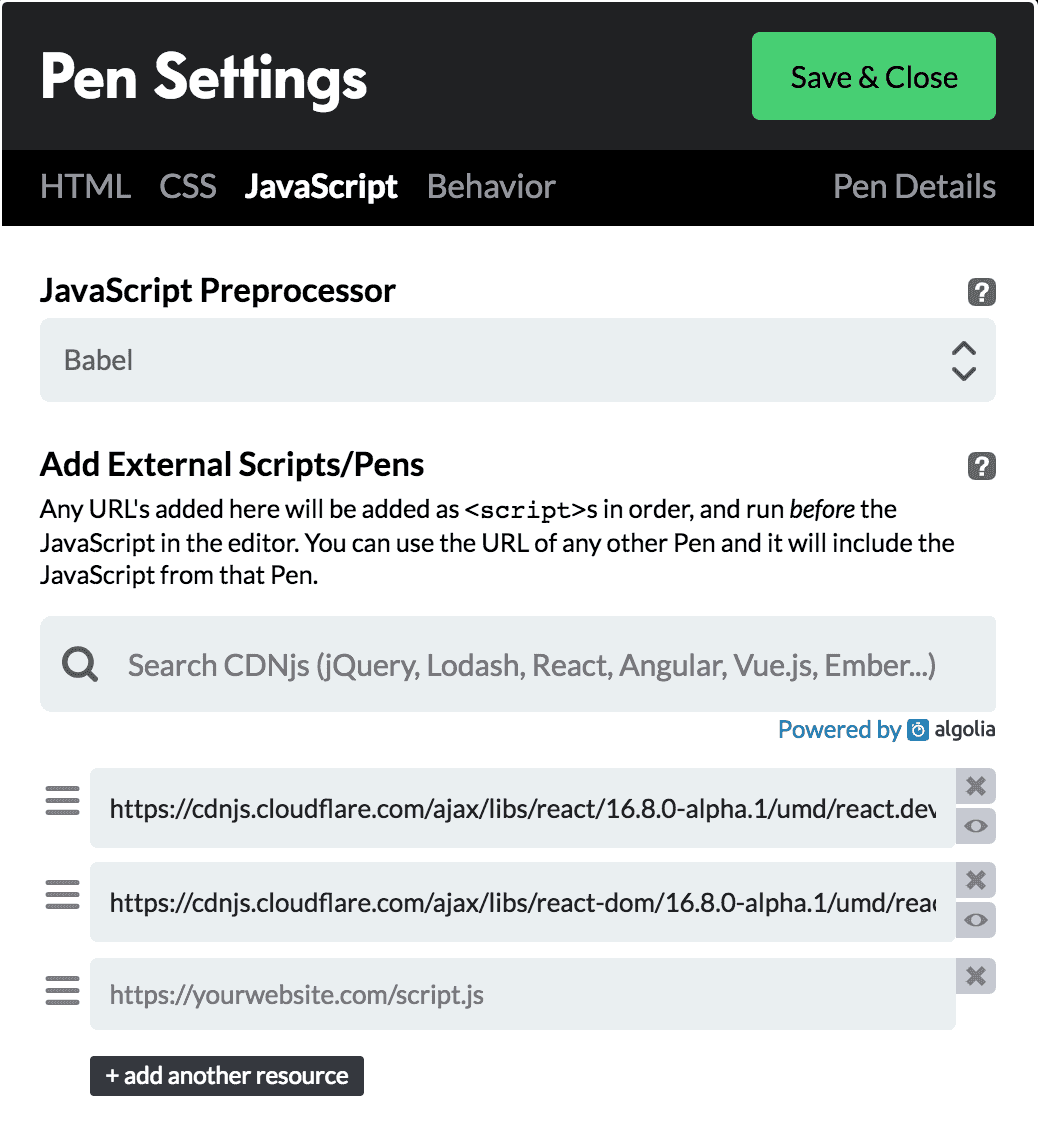
);This won’t quite work yet. We still need to configure our pen to work with React. Under the JavaScript tab of your pen settings, add React and React DOM as dependencies:
- https://cdnjs.cloudflare.com/ajax/libs/react/16.8.0-alpha.1/umd/react.development.js
- https://cdnjs.cloudflare.com/ajax/libs/react-dom/16.8.0-alpha.1/umd/react-dom.development.js
I’m using version 16.8.0-alpha.1 because, as of the time of this writing, it is the latest React version with hooks support, but feel free to use the latest version of React.
Now, set Babel as the JavaScript preprocessor. Your JavaScript settings should something like this:
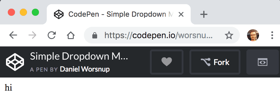
At this point, you should see “hi” rendering into the CodePen preview:
Let’s setup some simple styling. In your pen’s CSS settings, set the preprocessor to Less and add the following style declarations in the CSS editor:
.menu {
  width: 200px;
}

.item {
  background: #aacbff;
  box-sizing: border-box;
  cursor: pointer;
  padding: 10px;
  transition: background-color .05s ease-in-out;

  &:hover {
    background-color: #8cb8ff;
  }
}
In effect, these styles give our menu a fixed width of 200px (for now), and give our menu items a background color and a hover effect. Let’s start work on an Item component that will be used for each of our menu items. Add the following code below the Menu component in the JavaScript editor:
const Item = ({ children, onClick }) => {
  return (
    <div className='item' onClick={onClick}>
      {children}
    </div>
  );
};
Our Item component simply renders its children, binds an onClick handler, and applies the item CSS class that we already created. We also need to update our Menu component to use the menu class:
const Menu = ({ children }) => {
  return (
    <div className='menu'>
      {children}
    </div>
  );
};
We can now combine our Menu and Item components to render something a little more interesting! Update the ReactDOM.render() call to look as follows:
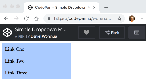
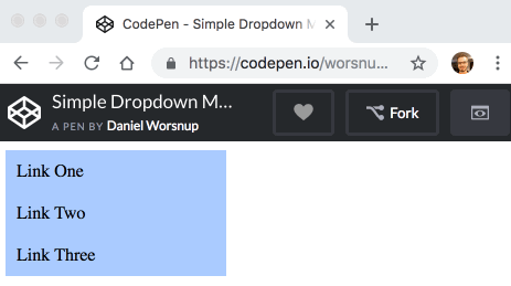
const menuInstance = (
  <Menu>
    <Item onClick={() => alert('Link one clicked!')}>Link One</Item>
    <Item onClick={() => alert('Link two clicked!')}>Link Two</Item>
    <Item onClick={() => alert('Link three clicked!')}>Link Three</Item>
  </Menu>
);

ReactDOM.render(menuInstance, document.querySelector('#root'));
These changes should produce the following result:
The last feature we need to wrap up this post is an initial implementation of opening and closing the menu on hover. For this, we’ll need to add some state to our Menu component:
const [isOpen, setIsOpen] = React.useState(false);The isOpen state should be set to true when a mouseenter event fires on the menu element, and it should be set back to false when a mouseleave event fires. We can accomplish this by adding the following props to the div rendered by Menu:
onMouseEnter={() => setIsOpen(true)}
onMouseLeave={() => setIsOpen(false)}
To make sure this works, let’s add a little border to our menu when isOpen is true. Menu should now look like this:
const Menu = ({ children }) => {
  const [isOpen, setIsOpen] = React.useState(false);

  return (
    <div
      className='menu'
      style={isOpen ? { border: '1px solid #000' } : {}}
      onMouseEnter={() => setIsOpen(true)}
      onMouseLeave={() => setIsOpen(false)}
    >
      {children}
    </div>
  );
};
And you should see the following result:
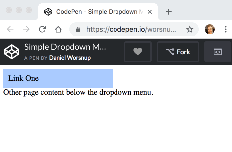
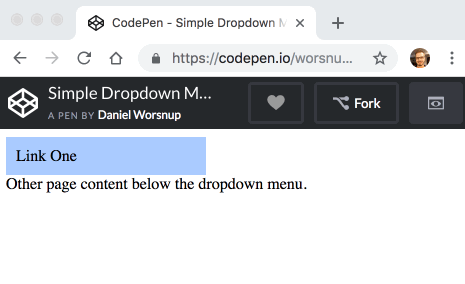
Of course, what we actually want is for isOpen to show the rest of the menu items. When isOpen is false, only the first item should be displayed, and it should affect the flow of the elements around it. When isOpen is true, the rest of the items should be displayed, but they should not affect the flow of the page. To make sure we get the element flow right, let’s add a bit of text below the React root node in the HTML editor:
<div id="root"></div>
Other page content below the dropdown menu.
Next, we’ll remove the temporary style prop from Menu and use React.Children.toArray to convert the children prop into an array. We can use this array to do some simple conditional rendering. Let’s take inspiration from functional programming and call the first menu item head and any remaining items tail. We’ll always render the head item, but conditionally render the tail items only when isOpen is true.
Here is the final JavaScript for this post:
const Menu = ({ children }) => {
  const [isOpen, setIsOpen] = React.useState(false);
  const [head, ...tail] = React.Children.toArray(children);

  return (
    <div
      className='menu'
      onMouseEnter={() => setIsOpen(true)}
      onMouseLeave={() => setIsOpen(false)}
    >
      {head}
      {isOpen && <div className='open'>{tail}</div>}
    </div>
  );
};
With these changes, everything works except the page flow issue:
The flow issue is easily fixed by applying some positioning styles around the open class. We also need the menu class to be position: relative so that any absolutely positioned descendant elements are positioned relative to the menu. The final CSS for this post is as follows:
.menu {
  position: relative;
  width: 200px;
}

.item {
  background: #aacbff;
  box-sizing: border-box;
  cursor: pointer;
  padding: 10px;
  transition: background-color .05s ease-in-out;

  &:hover {
    background-color: #8cb8ff;
  }
}

.open {
  position: absolute;
  top: 100%;
  width: 100%;
}
With this in place, our component does everything we set out to make it do in this post:
Even though this first pass produced a simple implementation, we have a solid API in the works. Notice how consumers of the Menu and Item components already have complete control over the contents and styling of each menu item.
For example, let’s imagine that a consumer has built their own component implementing the appearance and behavior of a sophisticated dropdown menu item. Maybe it includes images and text in an advanced layout and adds some fancy hover effects. Perhaps this component is called MySophisticatedMenuItem. When the consumer is ready to add dropdown behavior to instances of their component, all they need to do is wrap their components with our Menu and Item components:
function MySophisticatedDropdownMenu({ items, onSelect }) {
  return (
    <Menu>
      {items.map((item) => (
        <Item key={item.id} onClick={() => onSelect(item)}>
          <MySophisticatedMenuItem item={item}/>
        </Item>
      ))}
    </Menu>
  );
}
This CodePen shows the final code from this post, with a few styles added. The next part of this tutorial will look at implementing submenu support. Stay tuned!
Thanks for reading!

Written by Daniel Worsnup. All my links.